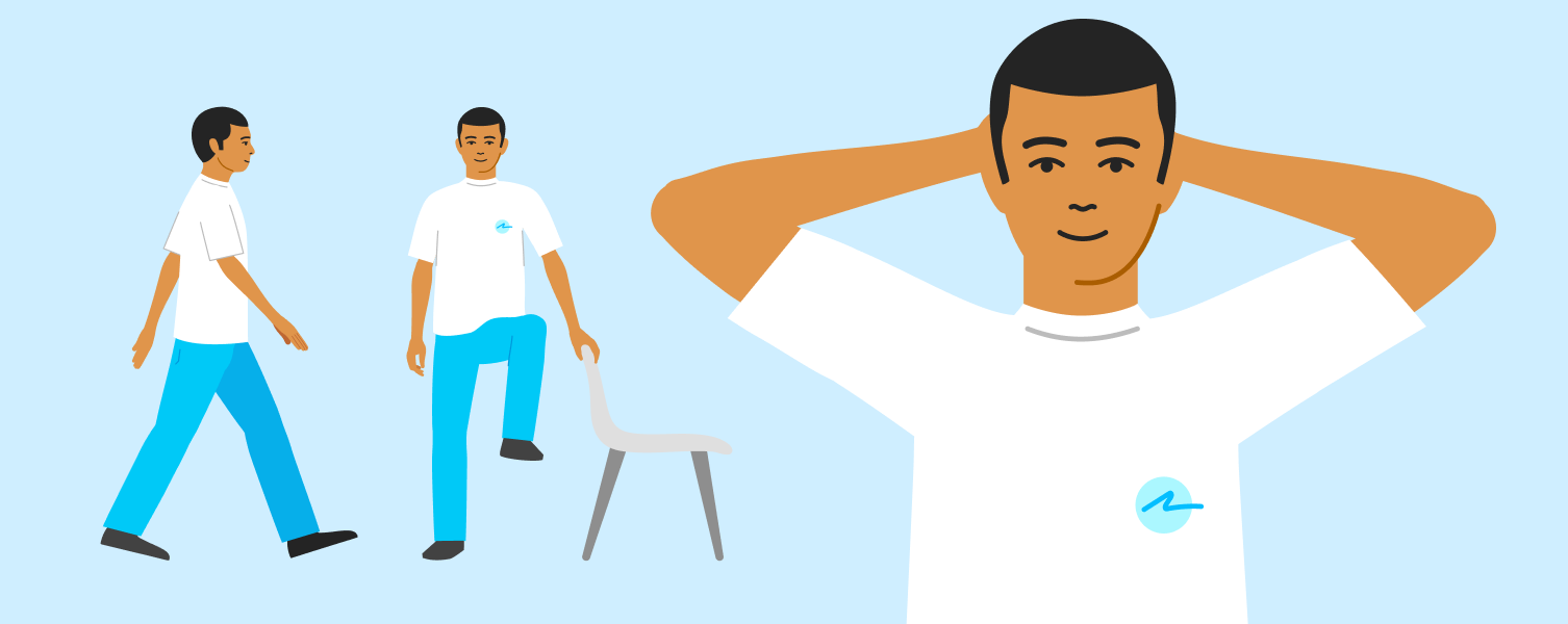
Mobile Screenig
Livez・Preventive Care・B2B2C Startup
Role: UX/UI, Illustration, Animation
2023
Role: UX/UI, Illustration, Animation
2023
In this project, we turned a preventive medicine protocol into a mobile self-screening, letting patients do it on their own, no doctor required.
THE PRODUCT
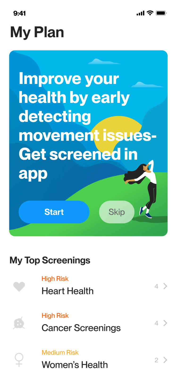
Livez App
an autonomous personalized prevention medicine platform that aims to help people reduce chronic diseases on their mobile devices.
MSK Self Screening
A screening within the Livez app that assists users with musculoskeletal issues get referrals by performing specific movements on mobile devices, replacing the need for a physical visit to a doctor.
THE CHALLENGE
Empower individuals to do their own musculoskeletal screening, usually done by a doctor.
THE SOLUTION
Save them time, spare them a potentially embarrassing meeting with the doctor, and make the screening easy and informative.

THE PROCESS
Protocol-Based
The project centers around a medical protocol adapted for a mobile product.
Tech-Design
In collaboration with the dev team, we explored our technical possibilities while concurrently developing the design concept.
Useability Testing & POC
Integrated usability testing throughout and after the design process. Additionally, created a POC to validate tech and design approach before diving into the detailed design work.
Outsourcing
With the assistance of an outsourced animator and illustrator, we crafted animated characters that guide users through the required movements.
Medical Collaboration
Continuous collaboration with the company's medical expert ensured accurate instructions and communication delivered to users.
QA
In the later phases of the process, we conducted design QA and user testing for further refinement.

MOTION TRACKER
Features
• Animated Instructions
• User Preparation
• Live Body Tracking
• Buttonless Interface
• Minimal & Large UI
• Voiceover & Captions
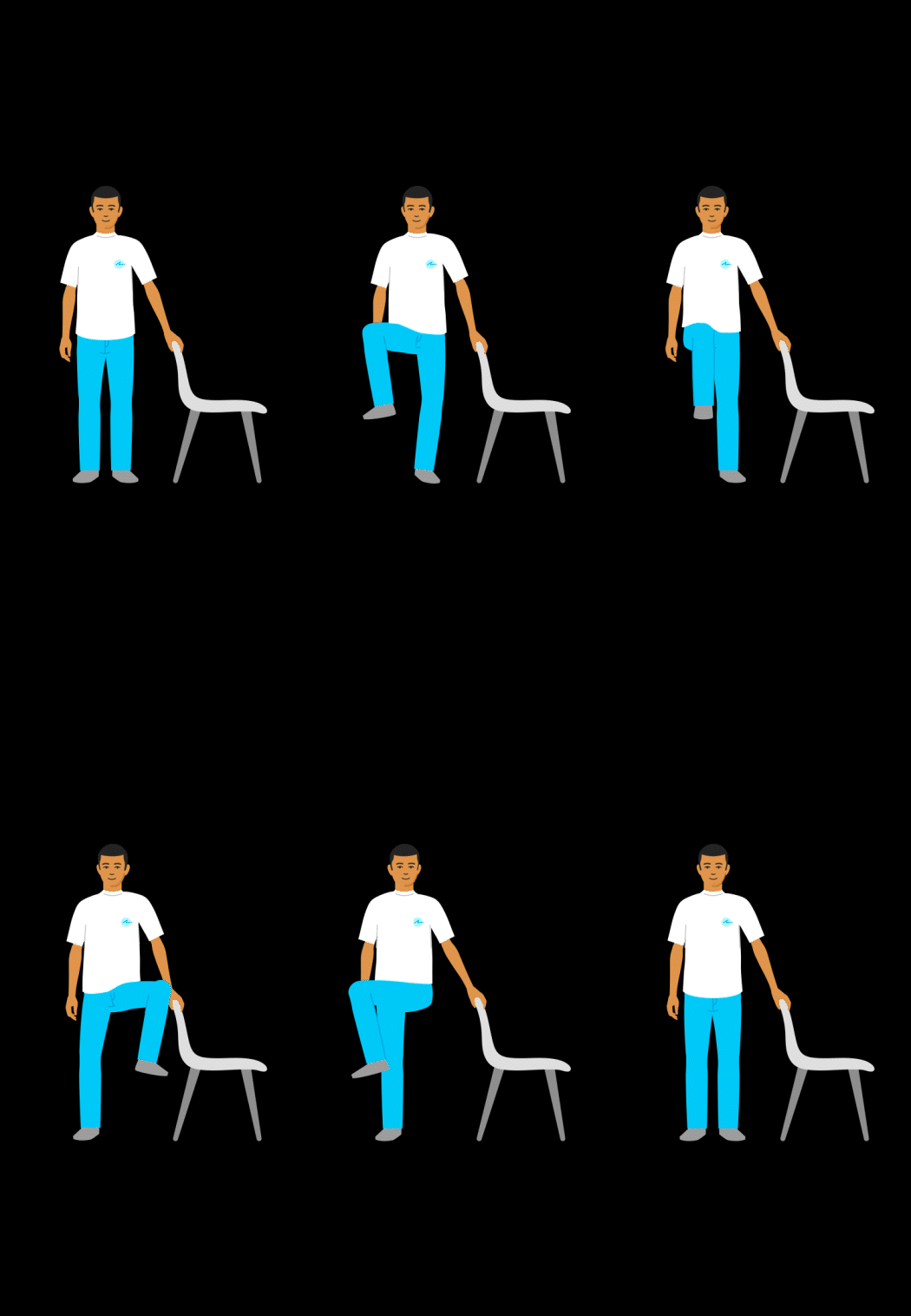
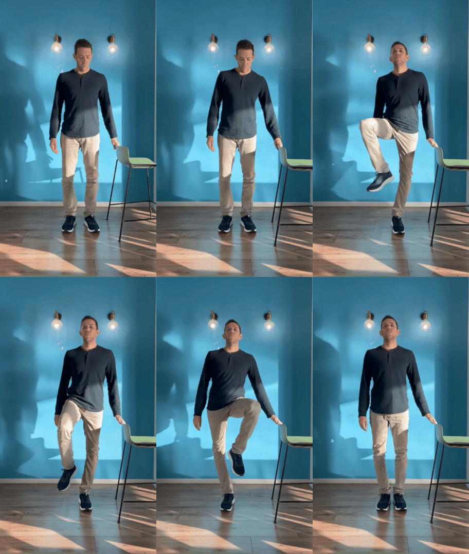
Animated Instructions
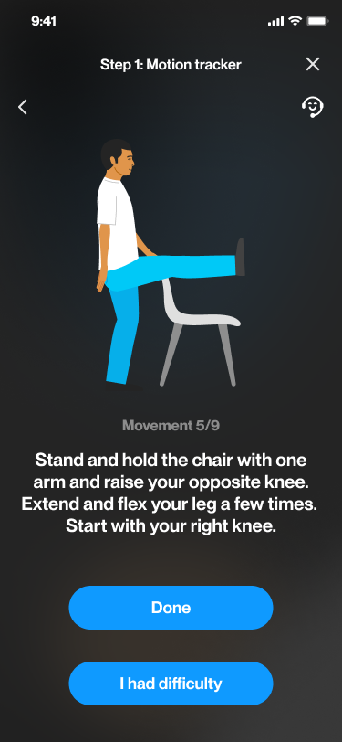
After learning the movements from our doctor, we filmed them to determine their order and create the main reference for character illustration and animation.
User Preparation
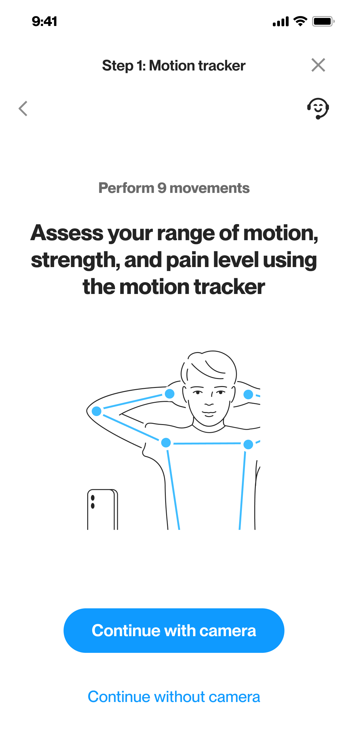
We design screens that prepare users, playing a vital role in helping them understand how to use the motion tracker effectively and maintaining the precision of body tracker measurements.

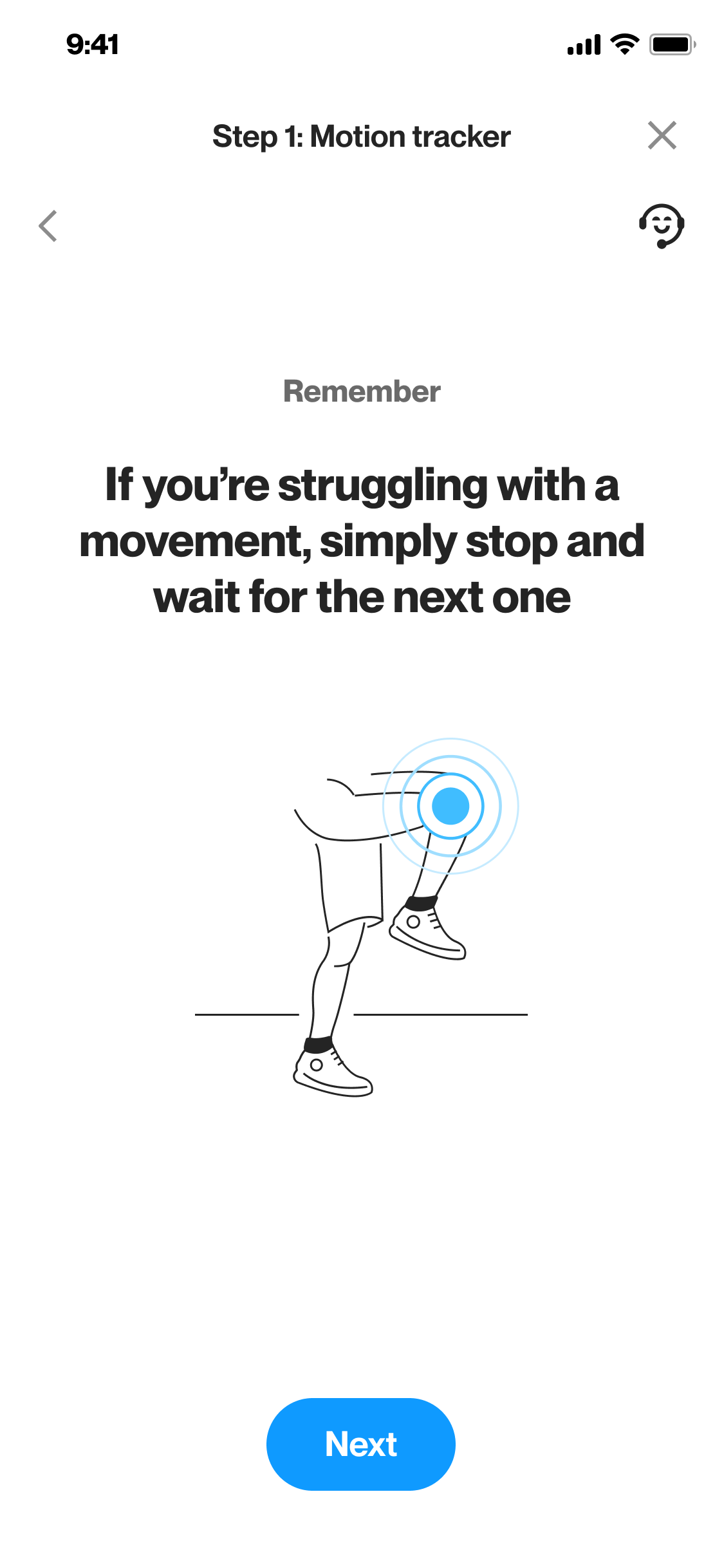
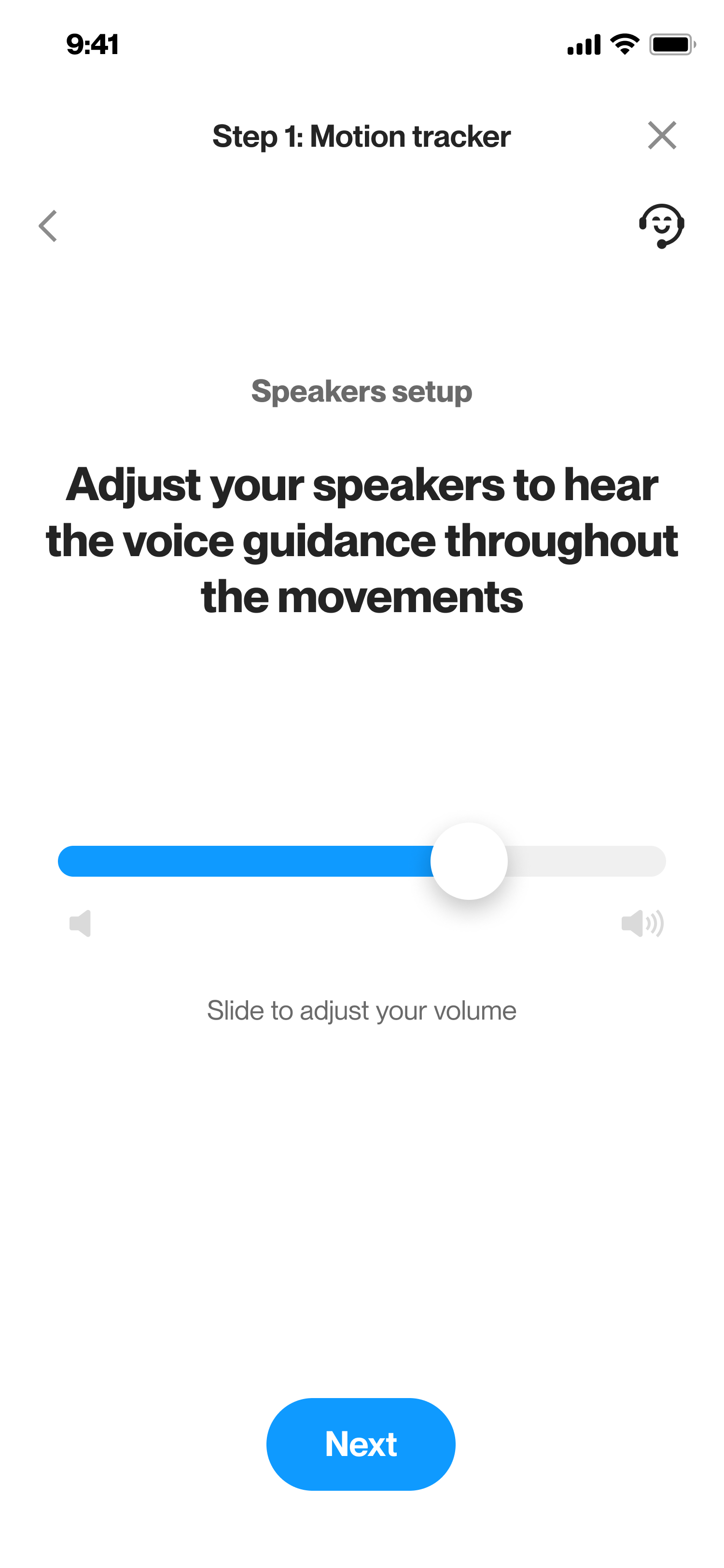
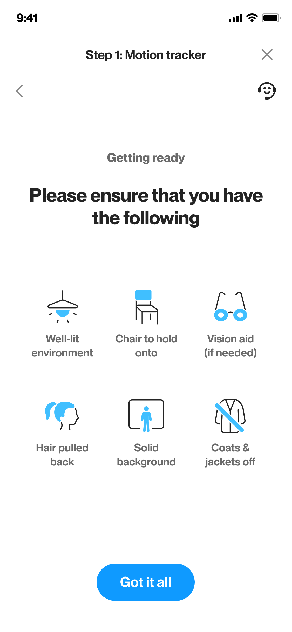
Motion tacker preperation screens (icons and illustrations by me)
Body Tracking
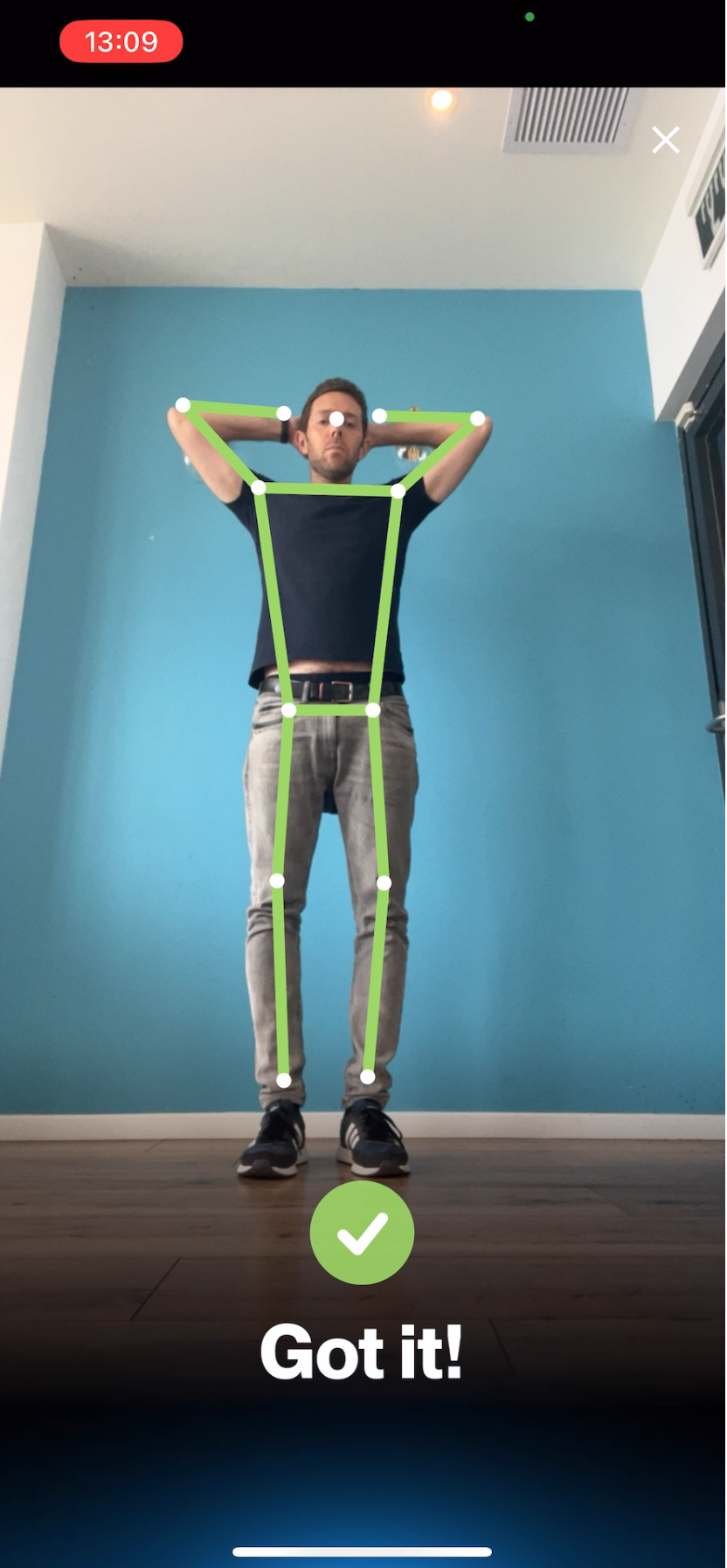
We used Google body tracking technology to demonstrate, validate, and accurately reflect the user's movements.
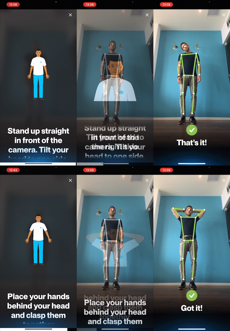
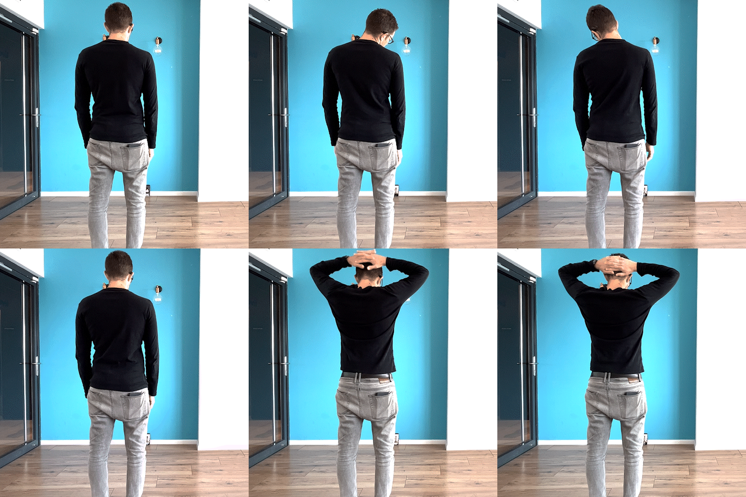
We realized the need to break down each movement into distinct movements and technically verify and provide feedback for each one individually.
![]()
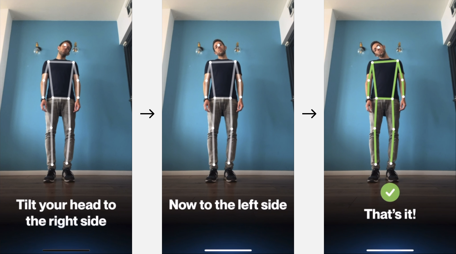
We created an alternative stream for users who don't grant camera access. They can follow the same instructions without body tracking and report any challenges.
![]()
![]()
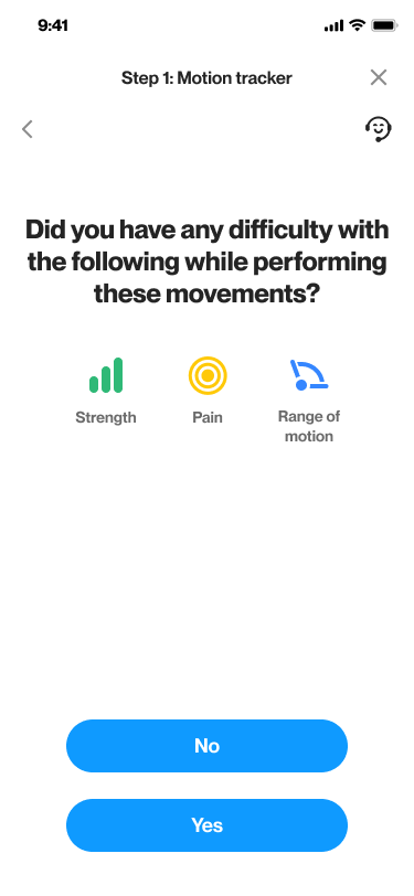
For a consistent user experience, we didn't require any actions during screening, like approaching the device, to avoid device movement.
Due to the device's small size and distance from the user, we increased the size of all UI elements.
To enhance clarity for users who may have difficulty seeing from a distance, we incorporated voiceover and rolling captions for instructions and feedback.
Buttonless Interface
For a consistent user experience, we didn't require any actions during screening, like approaching the device, to avoid device movement.
Minimal & Large UI
Due to the device's small size and distance from the user, we increased the size of all UI elements.
Voiceover & Captions
To enhance clarity for users who may have difficulty seeing from a distance, we incorporated voiceover and rolling captions for instructions and feedback.
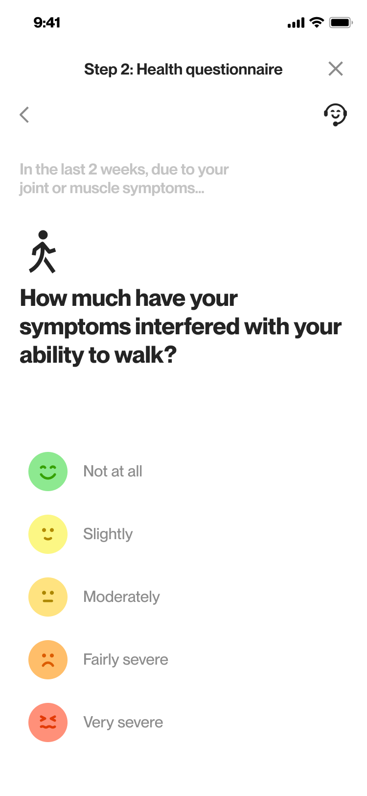
QUESTIONNAIRE
A series of questions similar to those a
sked by doctors, allowing users to rate the level of impact on their daily routine

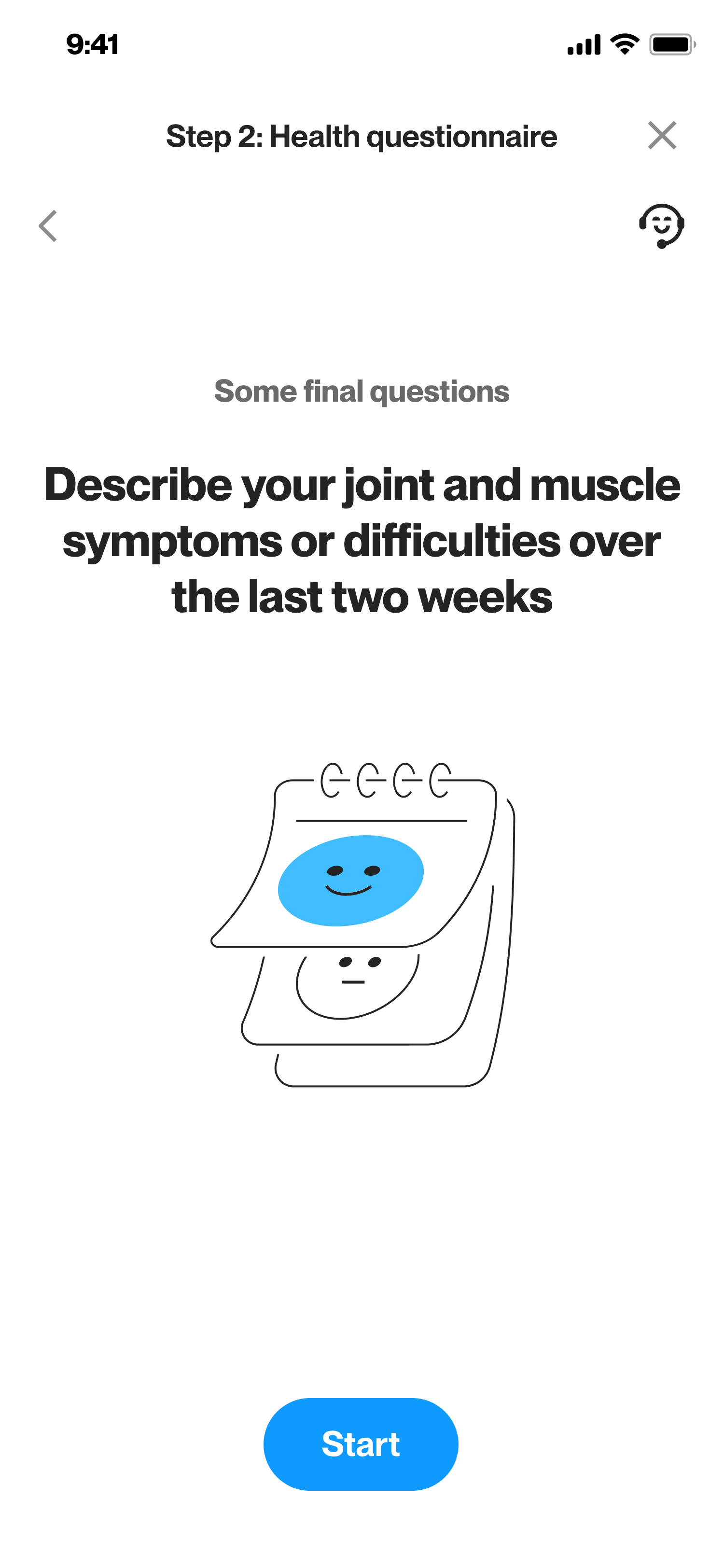
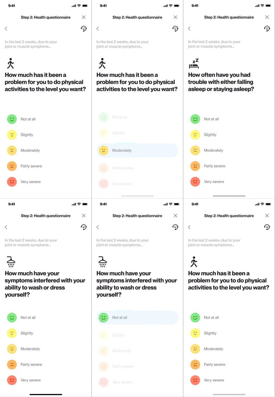
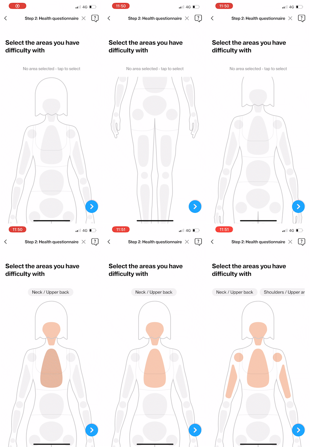
Questionnaire screens after Motion Tracker part
RESULT & ACTIONS
Immediately after completing the screening, users receive their results and are presented with recommended actions based on those results.
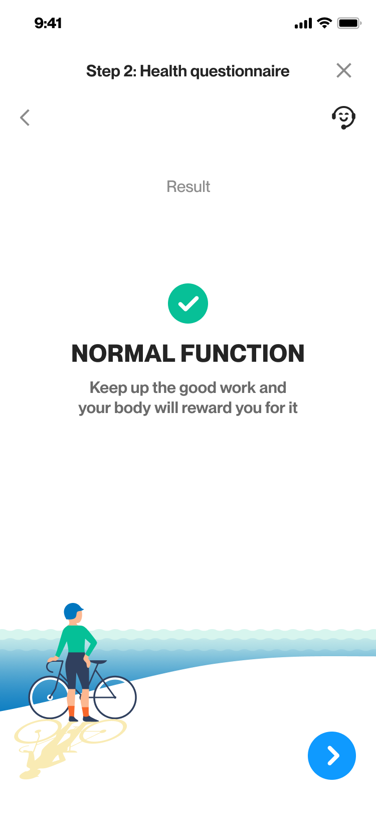
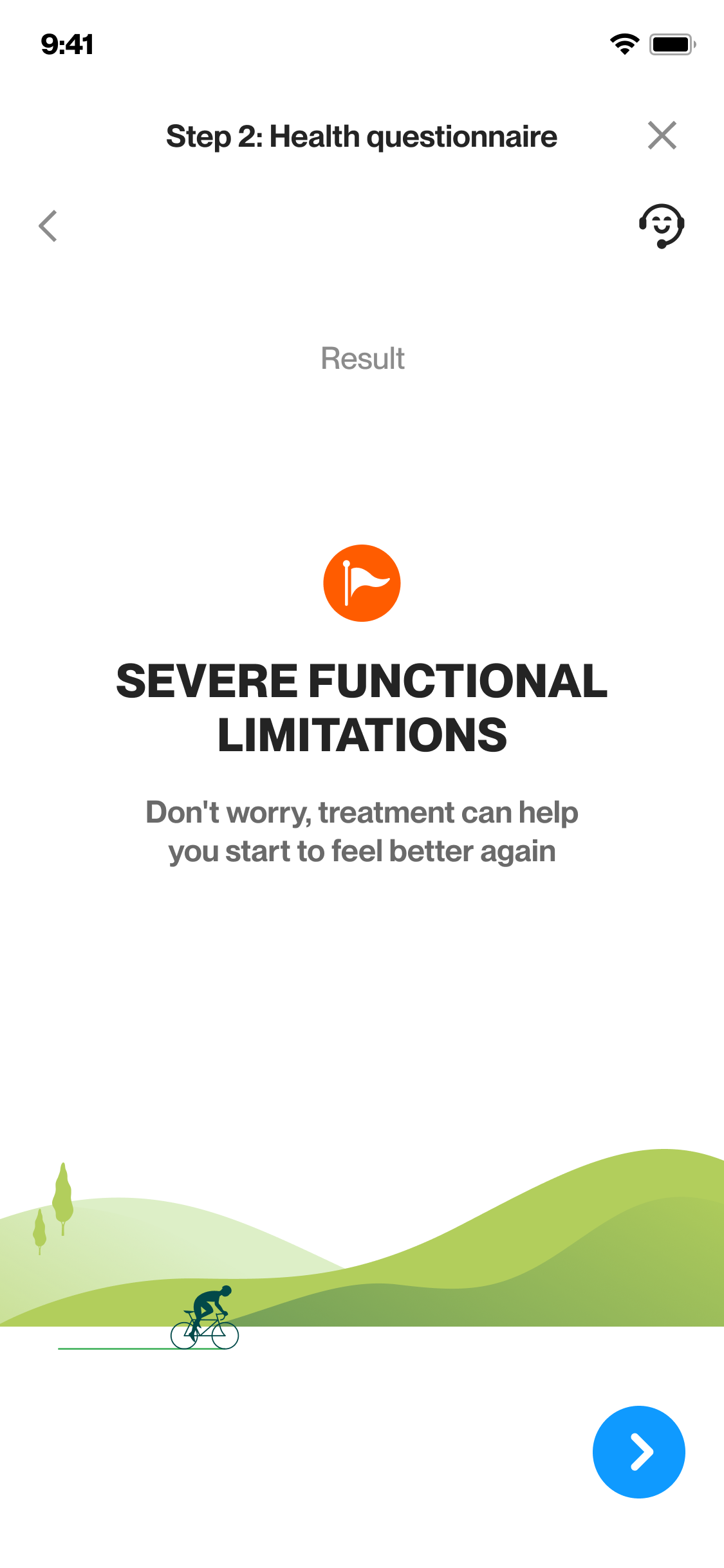
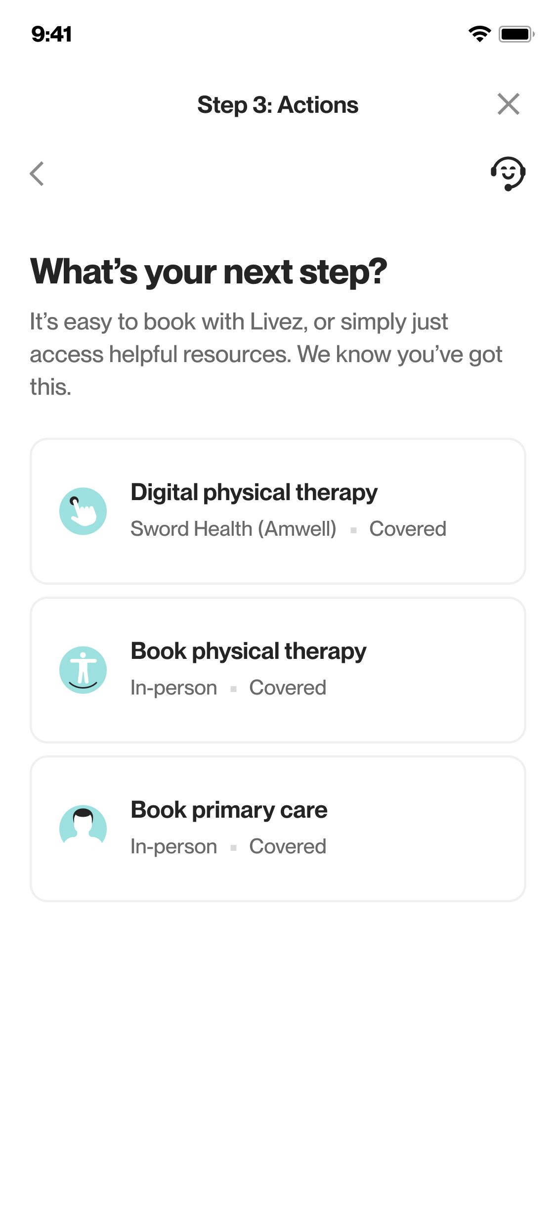
Result screens
TAKEAWAYS
Quick Conceptualization
Swiftly materializing the initial idea, even before final design, was essential, especially for less familiar technologies.
Developer Collaboration
Working closely with developers from the beginning helped bridge design and execution gaps, ensuring a smooth experiential concept.
Outsourcing Collaboration
I learned to manage and guide different external sources, seamlessly connecting them into one complete product
User Testing
I learned the importance of early user testing within the target audience, aligning design vision with real-world user experiences.