Kesh
Finance (B2C)
2021
Designed with Firma studio
Role:
UI Design, Library Building, Illustration, and UX Design
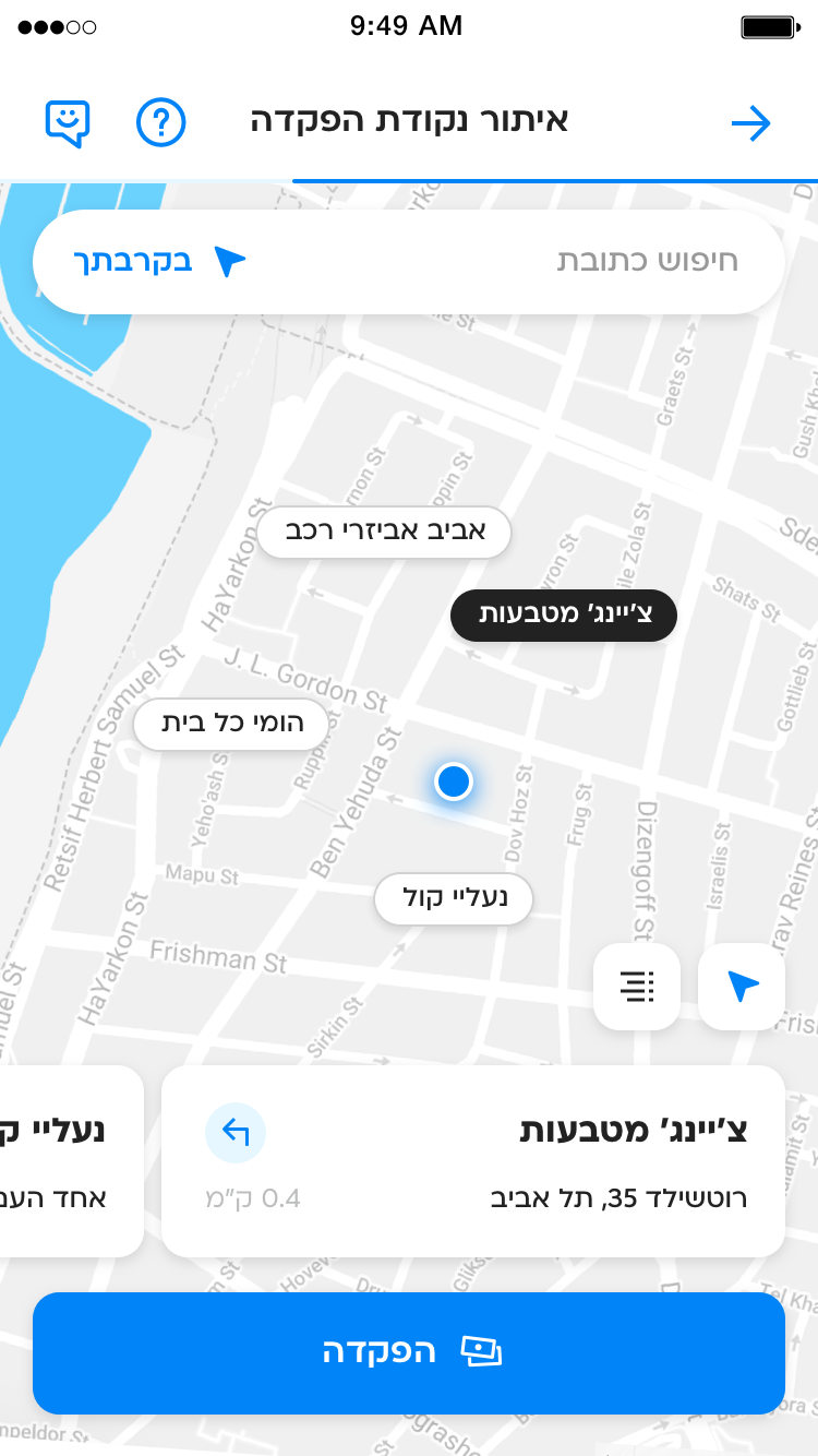
THE APP
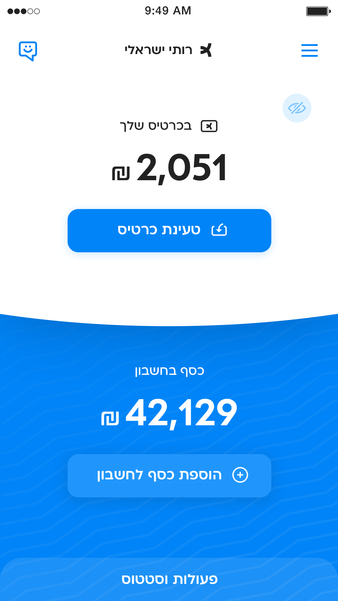
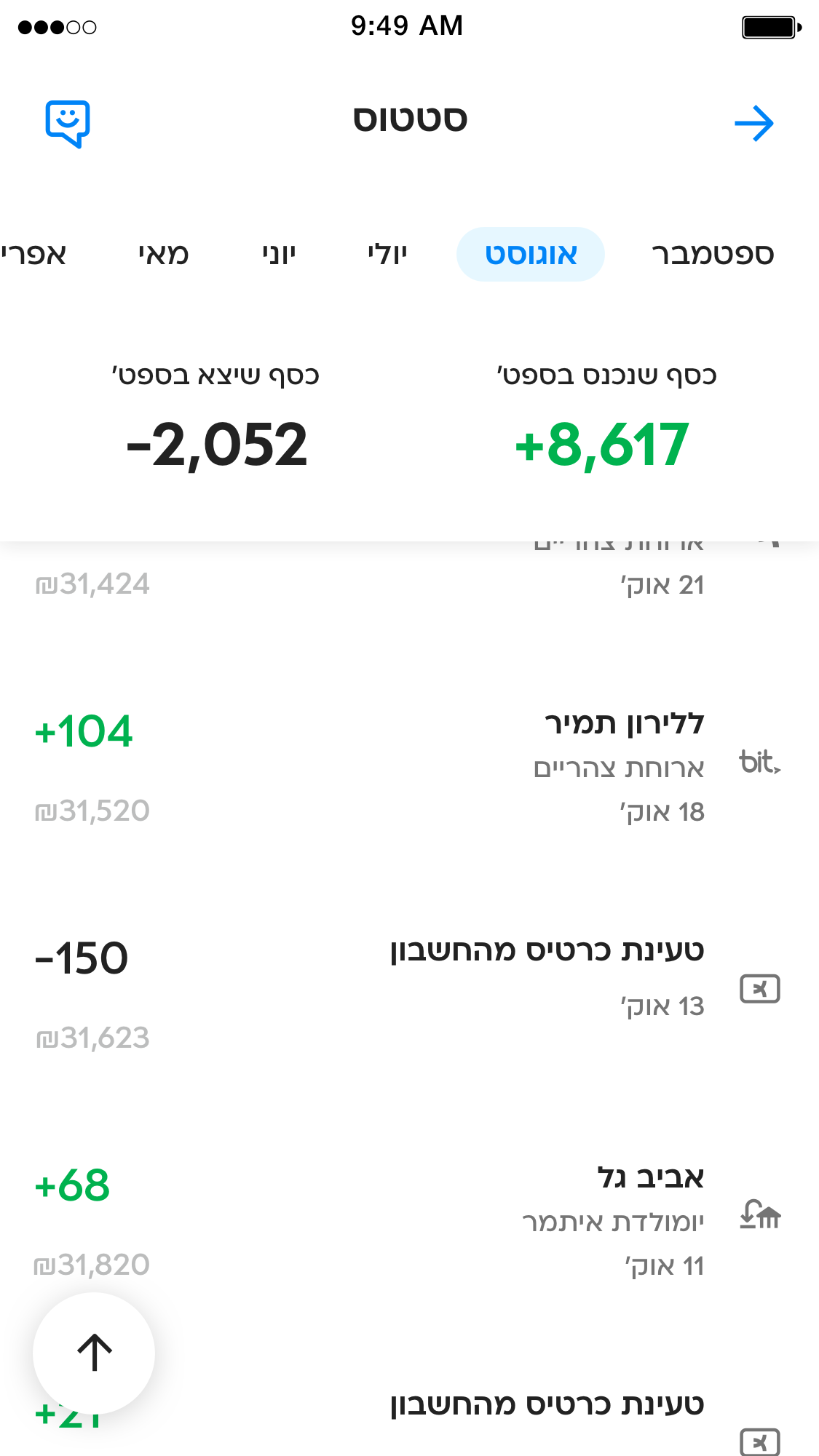
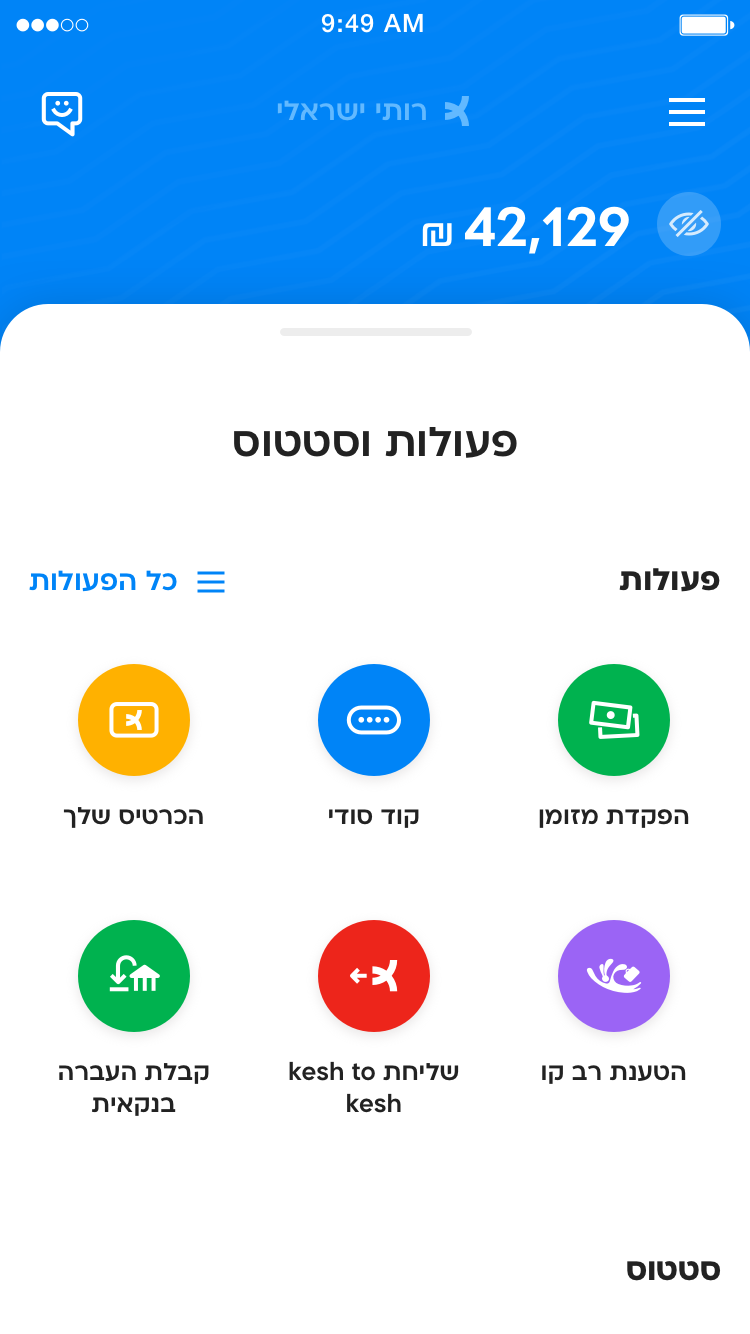
A digital wallet designed for individuals with banking challenges, allowing them to self-manage money without relying on a traditional bank account.
THE TASK
Designing a financial product whose core essence is "Free with your money," which conveys trustworthiness similar to a banking app, while delivering a lighter, more independent, tangible, and positive user experience.
THE PROCESS
The Role
In my role I was responsible for managing and executing the entire UI process directly with the client.
Experience Optimization
Collaborated with UX designer, combining thinking on wireframes to optimize the user experience, despite the formal separation of UX and UI tasks.
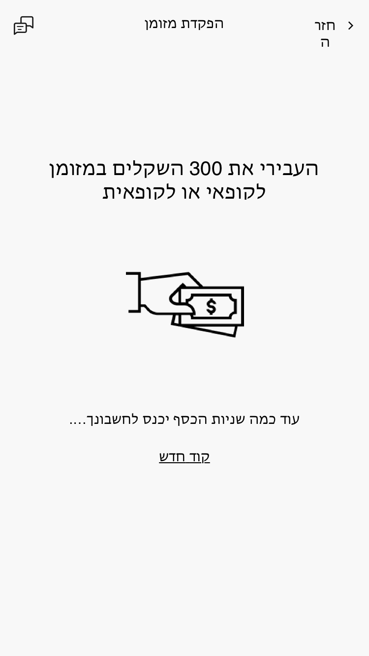
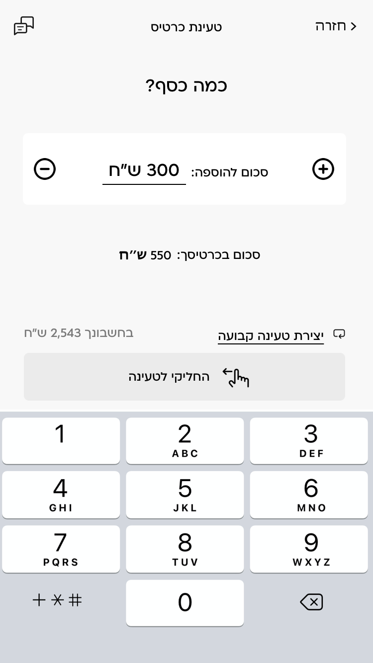
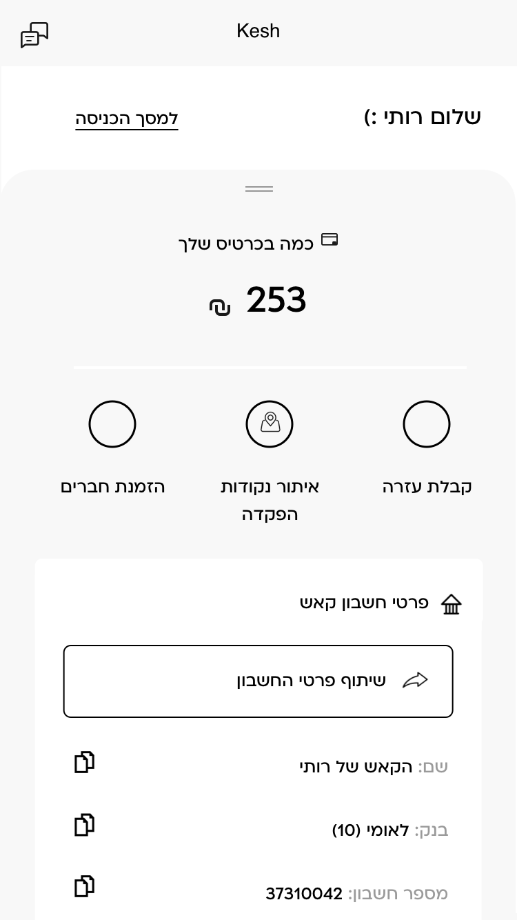
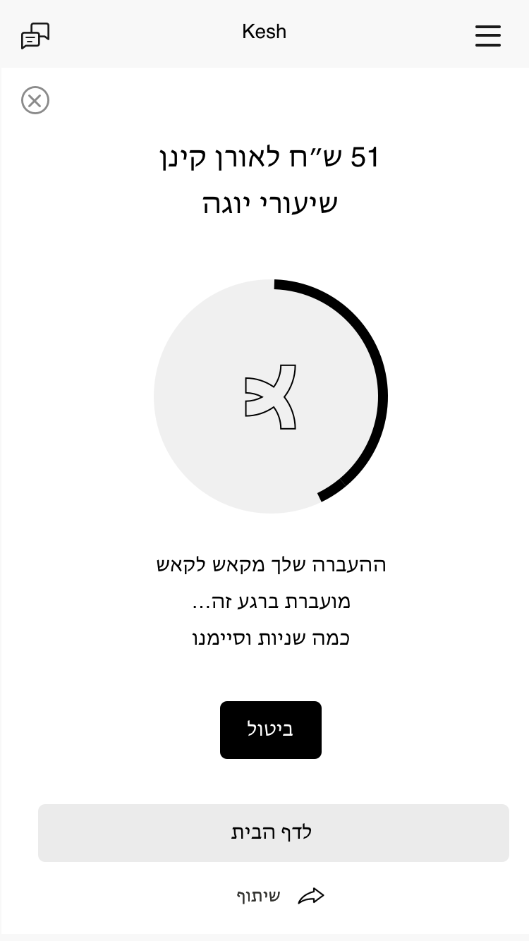
UX wireframes
FEATURES
White Spaces
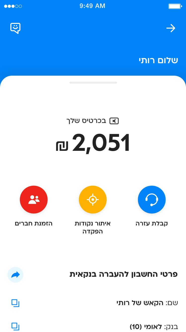
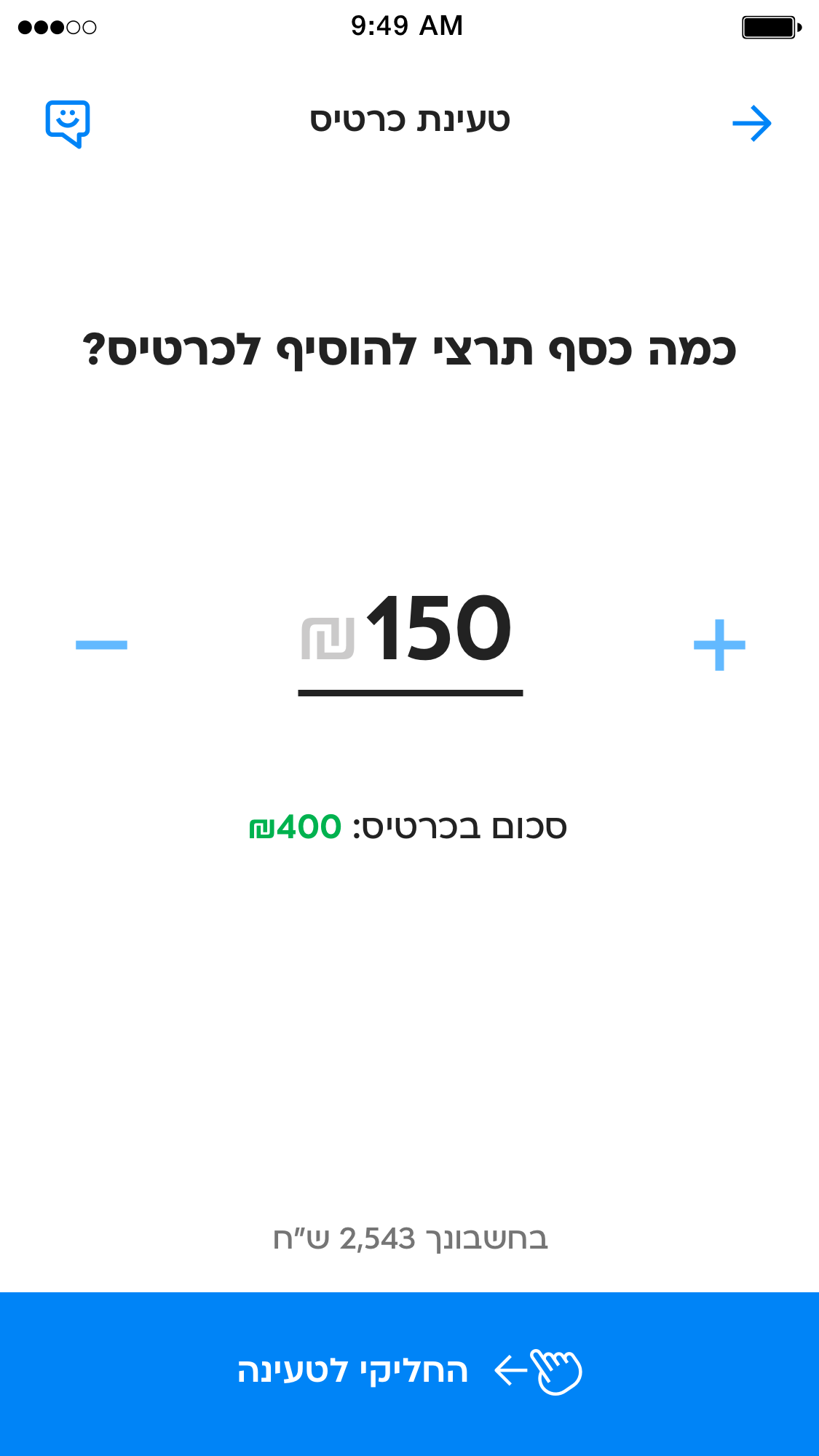
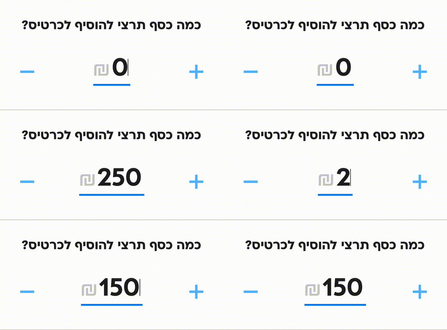
I've incorporated ample spacing around and between elements for improved user clarity, while also reducing clutter by minimizing graphic separation lines.
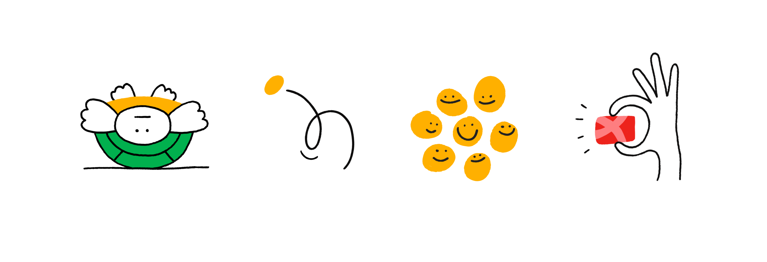
Light Illustrations
I developed a collection of illustrations with an easygoing and free-flowing style, to evoke a sense of lightness and approachability.
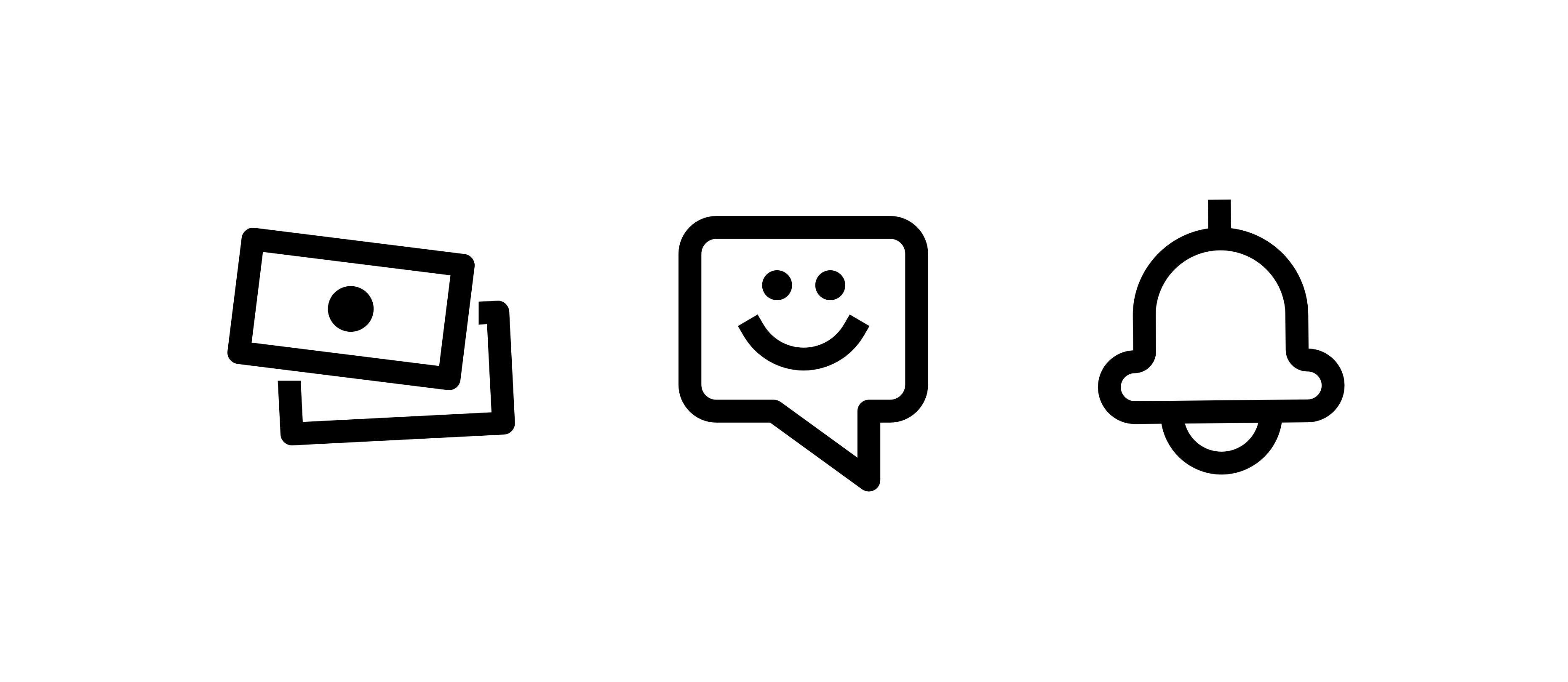
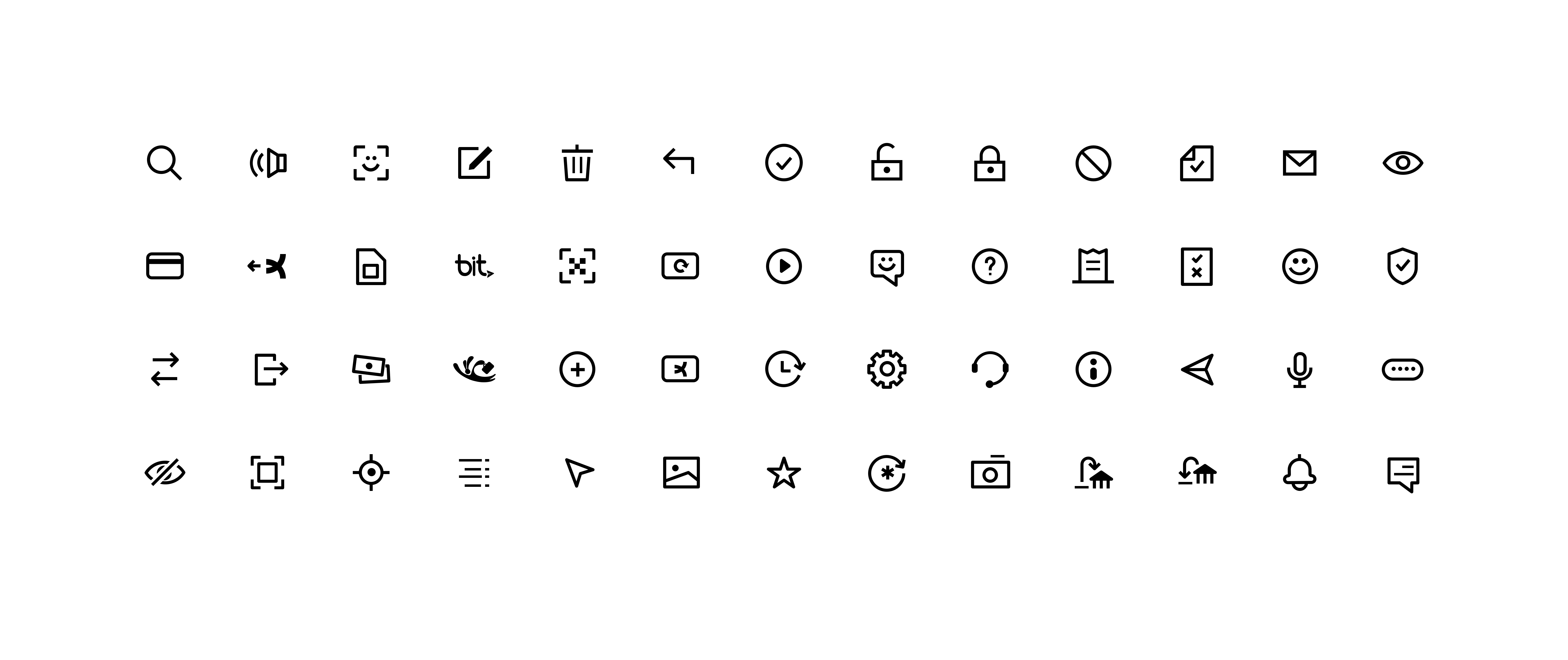
Chunky Icons
I designed slightly chunky and rounded icons with a friendly look, and ensured they match the font's style, establishing a consistent tone.
LIBRARY
Design System
I made sure the Kesh mobile app had a well-thought-out design system from the get-go, keeping things consistent and efficient.
User Centric
After extensive research and testing, I pinpointed the essential elements that would really connect with Kesh's target users, forming the core of the app.
Forward Looking
Establishing an organized design system with clear names, categories, and layers made it easy for fellow designers. They can now effortlessly find and customize elements to meet their specific needs.


GRID & LAYOUT
Standardization
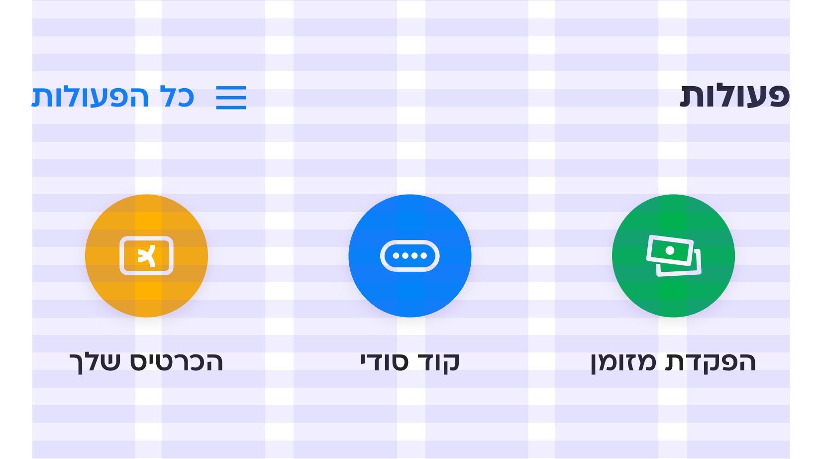
I standardized element dimensions and spacing in 8-pixel multiples.
Lego
This way, adding new elements and rearranging components is as straightforward as playing with Lego bricks.
