Driver Assist
(Confidential Client Project)
Automotive Tech (B2C)
2020
Designed with Manyone Studio
Role:
UX, UI and Animation

THE PRODUCT
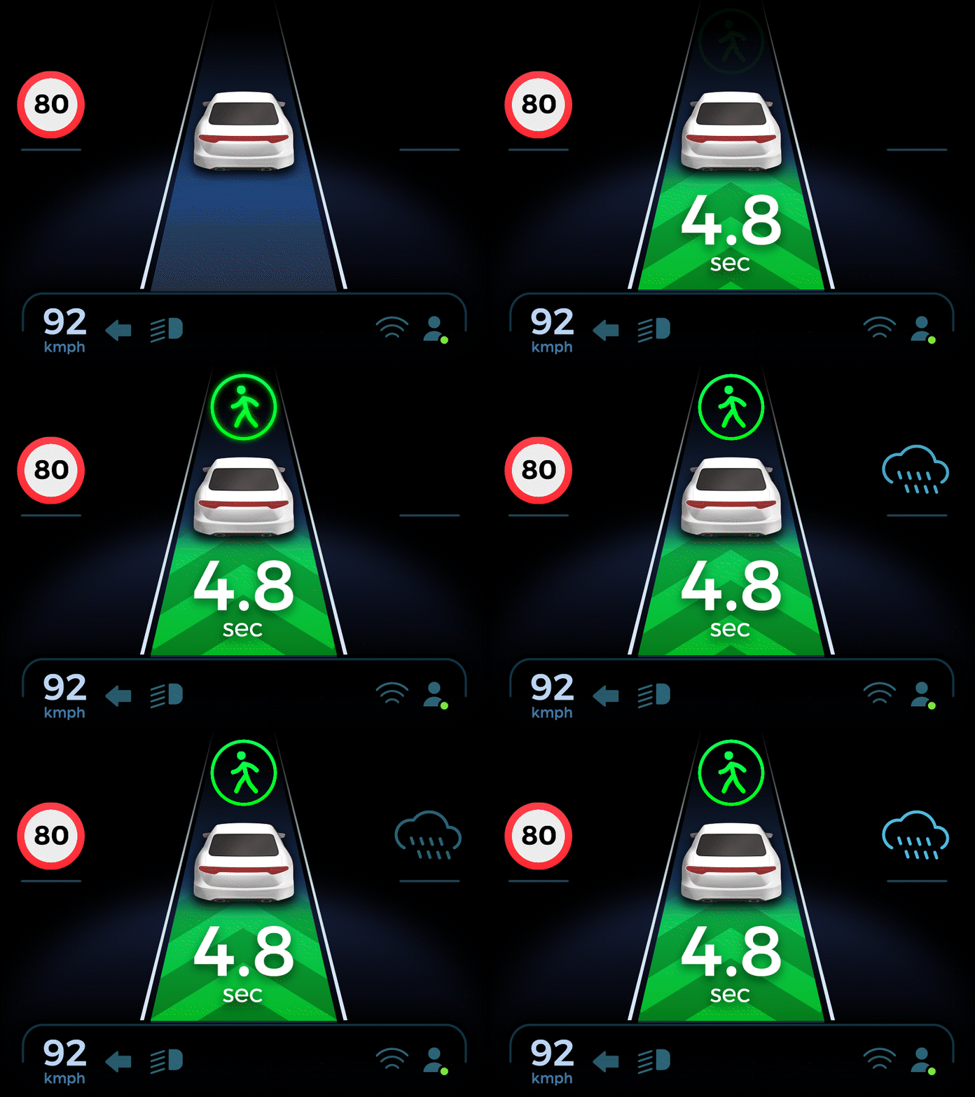
This product, from a car safety specialist company, acts as a small screen near the driver, warning of hazards like vehicles, pedestrians, and road conditions.
THE TASK
To design a screen that's clear, understandable, and suitable for real-time use while driving.
THE CHALLENGE
Displaying numerous indicators on a small screen while ensuring global clarity for all users.
THE SOLUTION
Designing a straightforward, minimal visual style with easily recognizable images.
THE PROCESS
Project Initiation
I started this project after our studio manager created initial sketches inspired by luxury cars. However, we hadn't seen the actual product designed for our interface.Unexpected Screen
To address this, I visited the company's offices for design testing on the final screen. It revealed challenges like low resolution and a smaller screen size than expected.
A Fresh Approach
These discoveries sparked a new perspective. I reconsidered the screen's details and how information was presented, resulting in a redesigned interface tailored to our project goals and screen limitations.
FEATURES
Layout
To prevent information overload, we prioritized key elements for simultaneous display. We experimented with different layouts to make essential information prominent during driving without distracting from less critical details.

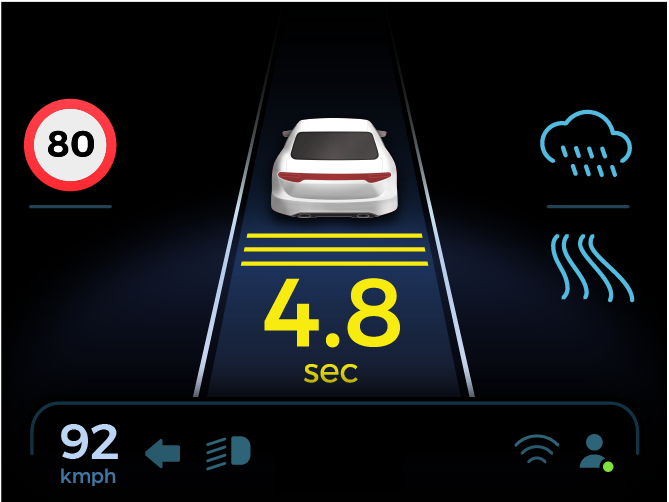
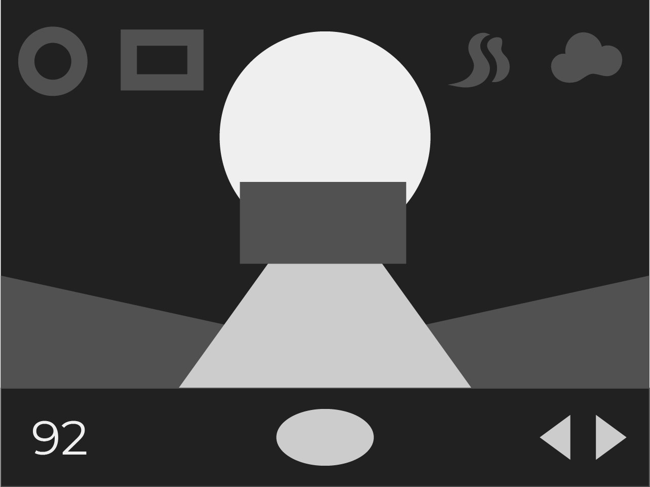

Layout attempts
Straightforward Icons
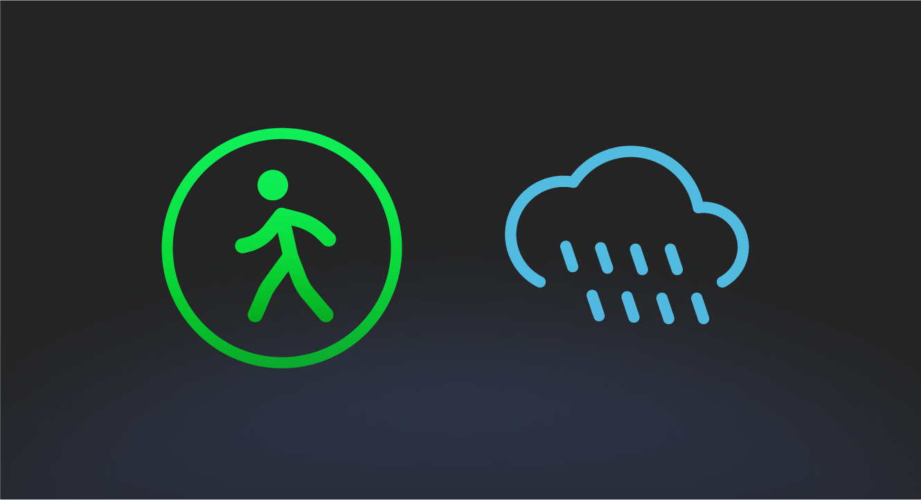
I initially designed detailed icons with color transitions. Yet, I later simplified them after realizing the need for clear identification, especially in low-resolution interfaces.

Animation
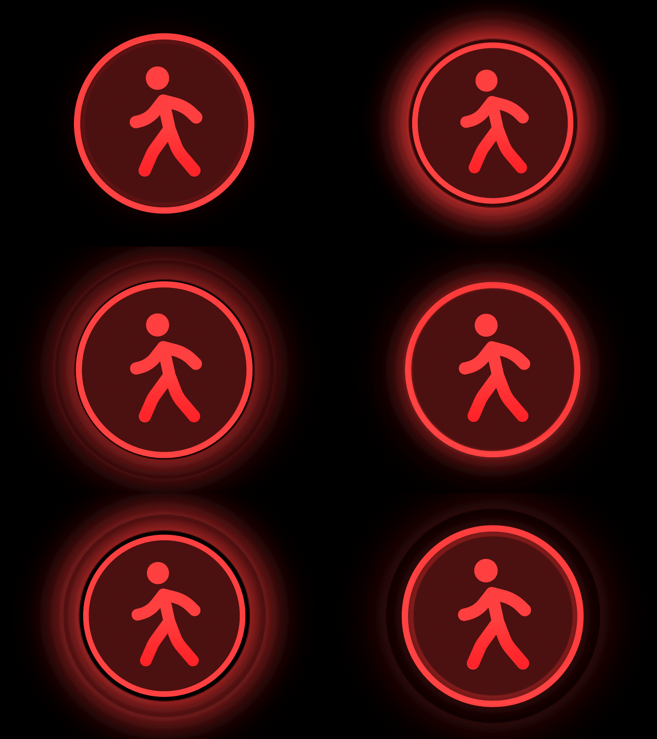
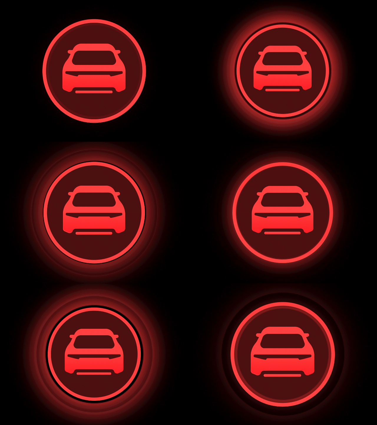
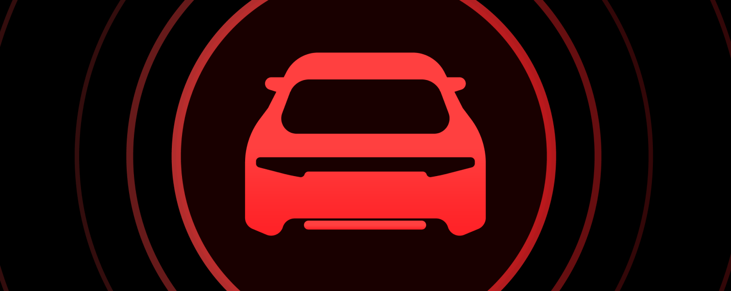
I aimed to design animations that would alert the driver to imminent dangers without inducing fear. Given the limited screen size, I chose to display essential notifications by overlaying the entire screen, highlighting them in red.
