Pepper
Banking App

Role
Product Design
UX Architecture
App
Finance
B2C
Context
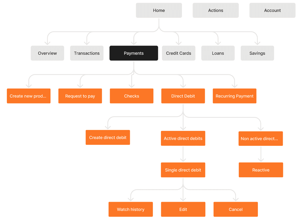
We redesigned the Pepper app, and I'm focusing on the Home screen and the Payments page.
Home Page & Widgets
I focused on the Home screen and its widgets, making Pepper feel more personal by allowing users to customize their main view.

Expenses Tracker Widget
We built the “Expenses Tracker” to track card and cash spending over a chosen time frame.

Initial

Ongoing

Final
Payment Methods
A central dashboard for all payment-related products that have dynamic statuses but are not prominent enough to appear on the main home screen.


The Users
Active customers using multiple payment methods in the app
User Pain Points from Support
Users Forget
Users forget which recurring payments they’ve set up.
Users Miss
Users don’t know where to look for specific payment details.
Users Late
Users only realize they've made a payment after it has been completed.
The Problem
Users struggle to track their different payment methods
Hypothesis
No Central Place
Payment methods are exisit at different areas and users don’t know what area look at.
Hidden Methods
User don’t remember all their active methods so they don’t look for them.
Unclear Status
Users feel confused about the many statuses and transcations each method.
Idiation
Dashboard showing active payment methods, their statuses, and actions.
Sketches
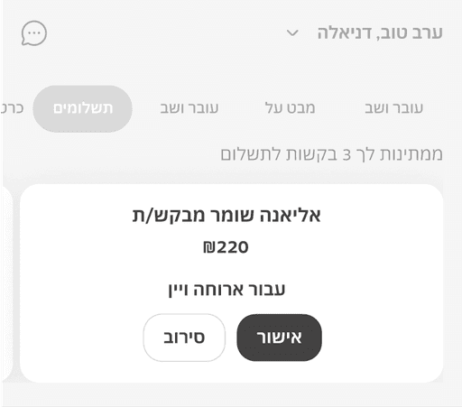


Quick view
Represent the big picture on top of page so users no need to dig in each prdocuts to know the the amount of pending actions they had.

Clear Statuses
Each payment method has a different statuses for each transactions. showing only relevant info on lobby page, to focus the use